UI Animation & VFX, UI/UX Design, Illustration
MOBILE SITE UNDER CONSTRUCTION
PLEASE VIEW ON DESKTOP

STAR WARS: COMMANDER
iOS, Android, Windows, Facebook Gameroom
-
ROLE: Senior UI Designer
-
PROJECT LENGTH: JAN 2014 - Present
-
RESPONSIBILITIES: UI & UX Design, UI Animations, VFX (UI and some Gameplay), Iconography, Unity Development, Live-Build Support
Star Wars: Commander is a Real-Time-Strategy game on mobile. The game has earned over $100 million in lifetime revenue and is still going strong as the longest running Star Wars mobile game to date.
Around mid 2013, Disney Interactive shifted its focus for the Palo Alto studio from casual games to mid-core games. My time with Alice in Wonderland: A New Champion came to an end as the game sunsetted, and I was extremely fortunate to be given an opportunity to fill a UI Designer role on the Commander team who was deep in pre-production development. The move marked a major turning point in my career as I began my transition from Illustration into the field of UI Design.
Since then, in my ongoing 4 years+ on Commander, my contributions along with my career grew from providing only UI visuals, to designing the UX for new features (from wireframes through live-production), partnering with other disciplines (Production, Product, Game Design, Engineering), and also expanding my visual design skills into the fields of Animation, VFX, and Motion Graphics.
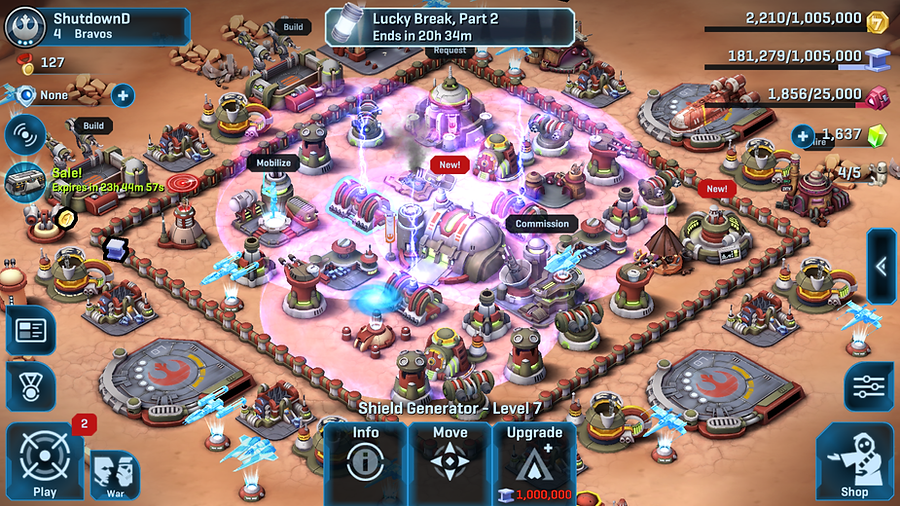
HUD DESIGN & CONSTRUCTION


DESIGN LOGIC:
8x8 Pixels Square - Base Unit of Measurement
(IMAGES SCALED UP FOR VISIBILITY)
-
Standardizes spacial relationships and alignments
-
Strengthens style and shape-language consistency
-
Aids in asset construction
BUTTON STATES:

BUTTON STATES NOTE:
Designed for mobile devices. Pressed effect needs to compensate for finger-coverage.
-
Vector Art visual assets created in Adobe Illustrator
-
Componentization practiced whenever possible to keep texture libraries efficient and performant
-
Assets imported as individual components, then constructed and grouped in Unity allows for greater editability and animations

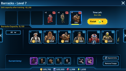
UX & UI DESIGN PROCESS: TROOP TRAINING RENOVATION

OVERVIEW (AS ORIGINALLY PRESENTED MAY 2018)
CHALLENGE
Currently, Unit Samples are awarded from opening crates. The Unit Samples are immediately placed in the HQ inventory and forgotten - resulting in large collections of unused Unit Samples.
GOAL
Design an user interface system to increase the number of deployed Unit Samples, such that players being to experiment with new load-out strategies

1
Players typically build load-outs starting by tapping on either the Barracks, Starship Command, Hero Command, Factory, or Cantina; not the HQ
2
Players may have playable Unit Samples for troops they have not unlocked yet
4
3
Some units inside the HQ troop inventory do not have an associated training* building and can only be accessed via the HQ, ex. Rancors
Units in training que, actively training, or paused, all contribute to load-out capacity. When selecting Unit Samples from HQ, players cannot see their current load-out capacity or which units they are currently training
*Using the term "training" (AKA "cooking") to apply to all of the following unit actions: Training Barracks Units, Commissioning Starships, Building Factory Vehicles, Mobilizing Heroes, and Hiring Mercenaries
STAGE 1: ANALYZE AND IDENTIFY CURRENT UX COMPLICATIONS
Comparing the typical Unit Training* flow side by side with the Unit Sample Flow clarifies how the two flows compete to achieve the same end results.
STAGE 2: ESTABLISH DESIGN PRIORITIES & DELIVERABLES
-
PRIORITY 1: Inform players they have available Unit Samples when training units within the typical training flow.
-
PRIORITY 2: Allow players to choose whether or not to use available Unit Samples.
-
PRIORITY 3: Allow players to see their current load-out simultaneously while training units.
-
PRIORITY 4: Allow players to edit their current load-out.
Priorities 3 & 4 (P3 and P4) have been player-requested game improvements for years and could easily be feature updates on their own. However, while the primary initiative to improve the surfacing of Unit Samples could directly benefit from P3 and P4, stakeholder feedback at this stage of discussion was to treat P3 and P4 as stretch goals.
STAGE 3: BRAINSTORM
Sketches based on research and gathering reference from other games
OPTION A
Troops with Unit Samples replace training cost with Unit Sample icon. Tapping on card with Unit Sample icon brings up sub-menu giving players the option to spend Unit Samples (free of charge, no training time) or train the unit normally.

OPTION B
Unit Sample version of troop is added to the troop carousel directly next to its "normal" card. First-tap on a Unit Sample card reveals Unit Sample quantity, continue tapping to spend Unit Sample(s). (Displaying the Unit Sample icon followed by its quantity appears too similar to currency.)

Stakeholder feedback was to move forward with Option A
STAGE 4: PROTOTYPE

Emphasized the need to enhance animations to reinforce new player actions
Animations and VFX created in Unity
STAGE 5: EXPLORE STRETCH GOALS (PRIORITIES 3 & 4)
Exploring solutions to display a "Current Army Tray" that includes a "Remove Troops" button. The Current Army Tray presented a solution for Lucasfilm's requirements of keeping "HQ Special Units" outside of any of the training buildings.

Current Army Tray - Version 1
Losing the second row the troop selection grid means longer scrolling, however general consensus believes benefit of being able to see current load-out outweighs the cost of losing the second row

Current Army Tray - Version 2
"Special Units" Button displays a sub-menu of Unit Samples for troops previously only available via the HQ Inventory
Remove Troops Menu: UX based off Troop Donation feature already in-game


STAGE 6: FINAL MOCK-UPS


STAGE 7: UNITY CONSTRUCTION

STAGE 8 - FINAL: FEATURE PUBLISHED SEPTEMBER 2018
BEFORE

AFTER

UX DESIGN: SQUAD WAR END TO REWARD COLLECTION
(MARCH 2016)
CHALLENGE
There are multiple use-case scenarios where users shall be notified their Squad War has ended and they have a reward to collect. In the best interest of contextualizing the user and encourage their reengagement with the Squad Wars feature, it is imperative the reward collection occurs in the Squad War "War Board" menu.
GOAL
-
Establish the different starting points, locations, and use-case scenarios for notifying users their Squad War has ended and they have a reward to collect.
-
Inform users of their Squad War results, guide them in a non-disruptive manner to their reward collection, end with the user in the War Board menu.
-
Solution should stay consistent with the general UX and visual style of Star Wars: Commander.
-
Solution should be performant.
SOLUTION (PROCESS)

STAGE 1: ANALYSIS SKETCH
Initial exploration establishes 5 primary use-case scenarios starting points.

STAGE 2: UX FLOW CHART DEVELOPMENT
DRAFT 2

DRAFT 1
-
Categorized and consolidated use-cases down to 3 starting points
-
The first drafted solution was primarily concerned with notifying users with the "War End" message (blue) followed with the CTA "Collect Reward" (yellow)
-
Draft 2 refines the flow so that all CTAs concerning reward collection (lavender) first bring the users to the War Board dialog. Any "War End" messaging the user receives prior to being on the War Board will be a "basic" message accompanied with a "Go to War Board to see results and collect rewards" CTA.
-
Draft 2 makes consistent all cases in which once users enter the War Board, they will receive the full detailed War End Message with "Collect Reward" as their only option to continue forward.

STAGE 3: FINAL UX FLOW
ICONOGRAPHY


